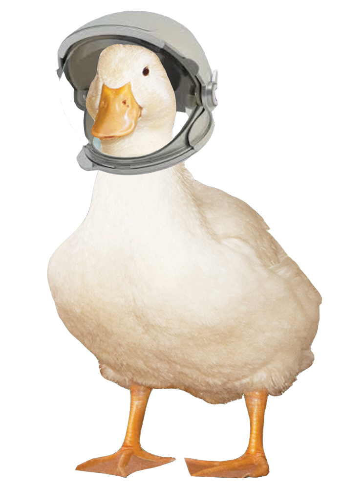
This image was made as a creative piece, I used one creative theme and turned it into something crazy but with the purpose of being, eye catching, random and to get people talking. The duck is now my signiture and appears on many of the pieces I create as he was a fun filled charater, he was named Robin due to the halls I lived in during first year (Robbins) as this is where I made him with my flat mate's.
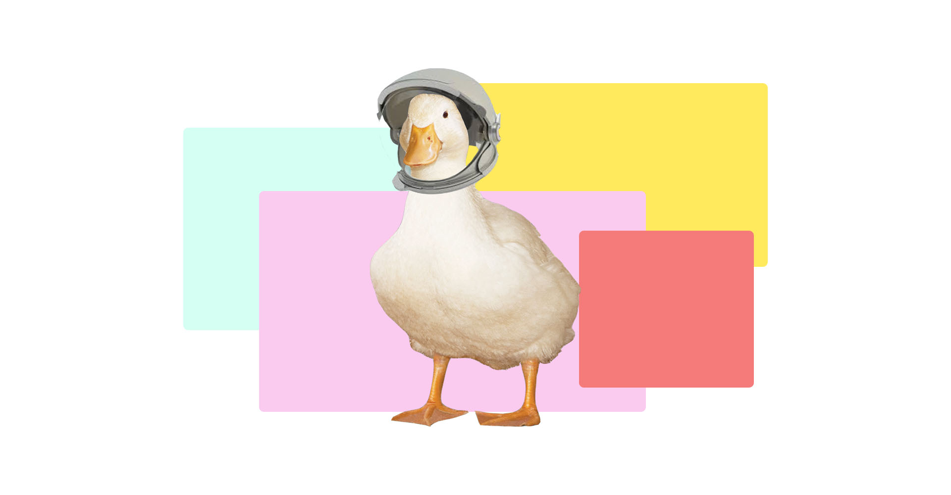
This image was made at the request of a friend, It shows how I can adapt and create what ever designs are needed.
We had a reflection on our poster as it was printed so I decided to make the poster that we would have designed if we had the chance to see our poster in big, we would have made the dots in a more arranged fashion, we also changed the colour of the dots because you couldnt see the blue caps properly, we moved the red dot as the top was very cluttered so moving it would make it more clear, the needles where not clear so i added a shadow behind them to make them stand out a bit more, in our original poster we used an arm injection this is the wrong place to inject so i added a picture of the correct way to inject in the thigh.
This was a logo I designed for a small business within my home town, the owner wanted a new professional logo as her company grew. We discussed designs and as balloons were her best seller we decided to go with this as the theme, she also wanted elegance so the font for the name needed to reflect the fun but professhional business. I made a few designs but she chose this one and loved it.